Menu Close

Lifecycle. the story

Brief: Lifecycle aimed to create a wellness brand that inspired health-conscious individuals. The challenge was creating a visual identity that embodied vitality and positivity while appealing to a broad audience.

Creative Brief: Lifecycle needed a brand identity that radiated energy and health. We designed a fresh, uplifting logo with a color palette that promotes well-being, ensuring the brand felt accessible yet sophisticated for anyone on their wellness journey.

Brandmark & Label's

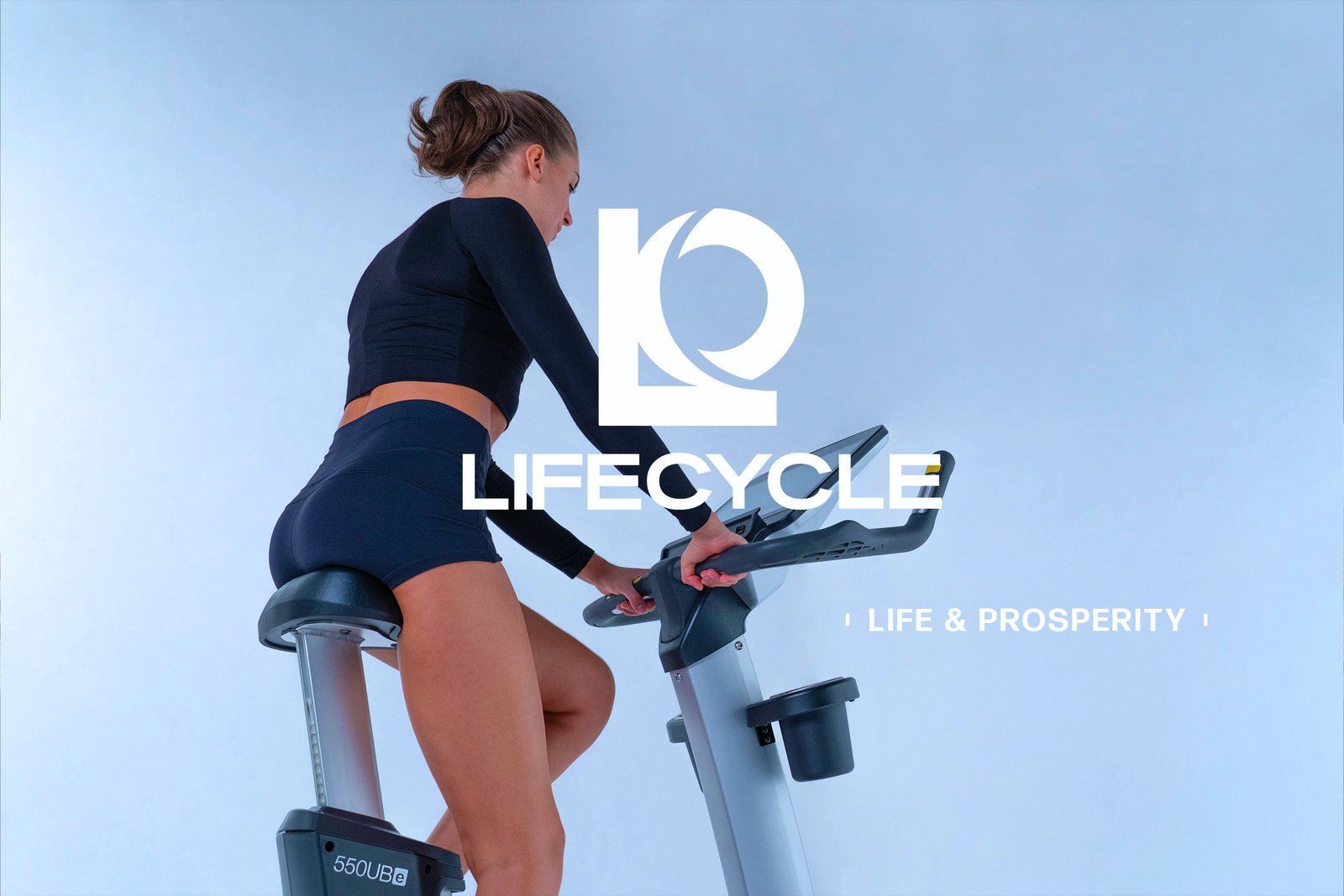
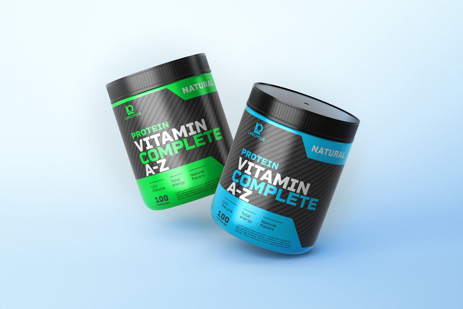
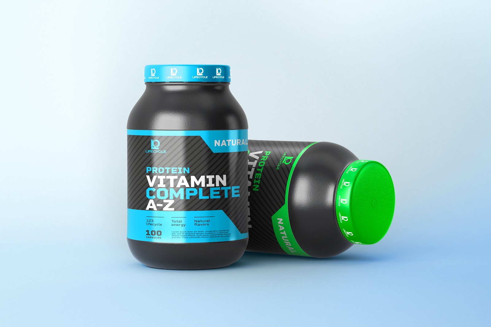
The Brand Strategy led us to craft a distinctive mark—an uppercase “L” seamlessly paired with a circular “O”, symbolizing motion and progress. The refined cut in the “O” reinforces the brand’s dedication to movement, vitality, and continuous growth. In addition, we designed a sleek and modern label system for their vitamin product line, focusing on simplicity, clarity, and a wellness-first approach.

Core Value

Fitness and well-being are core values at Lifecycle, driving the brand’s commitment to promoting a balanced, active lifestyle. With the introduction of their first fitness bike, Lifecycle offers a new way to achieve personal health goals, seamlessly blending innovation with vitality.

Conclusion

Lifecycle is a health and athletic brand committed to empowering individuals through fitness and well-being. With a focus on sustainable performance, it encourages a lifestyle of balance, strength, and continuous improvement. Lifecycle is more than just a health and athletic brand; it’s a commitment to promoting a balanced, active lifestyle. Through dynamic design and innovative products, we helped bring their vision of fitness and well-being to life, empowering individuals to embrace their full potential.